How Tesla Is Accelerating the Demise of Knobs and Buttons
A move to touchscreens has been a hallmark of Tesla's electric cars. Some brands are following suit, with mixed results.
 Tesla
Tesla
If you've spent any time in a modern vehicle, you're aware that driving now feels a lot like using a smartphone or tablet. Just about everything is controlled by touching a screen.
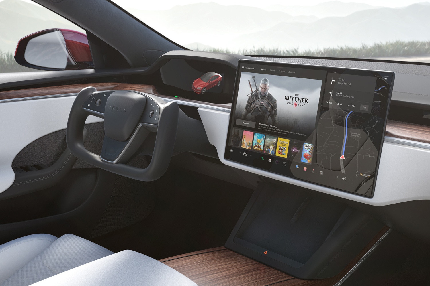
Tesla has been a proponent of the button-and-knob-free cockpit, touting its big touchscreen command center as a key selling point for its high-tech electric vehicles. But what works for Tesla doesn't necessarily work for all carmakers — or car buyers. Although other brands have followed Tesla's lead, the disappearance of real knobs and buttons hasn't always been well-received.
 Cadillac
Tesla's Strategy for a Button-Free Interior
Tesla was one of the first carmakers to abandon the old-fashioned automotive tradition of physical knobs and buttons, instead cramming ever more functionality into increasingly comprehensive (and correspondingly gigantic) touchscreens. In their most recent iterations, both the Tesla Model S sedan and Model X SUV don't even have physical gear-shift knobs. That essential function is now handled by a touchscreen.
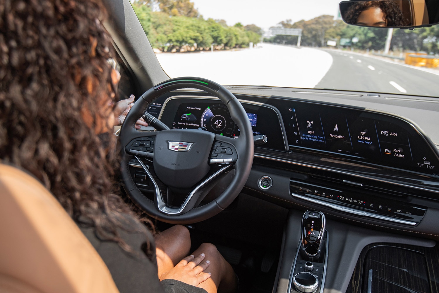
Tesla's lead helped to unleash a sort-of touchscreen arms race, bringing a slew of enormous touchable instrument panels and infotainment and navigation controls from other automotive brands. These range from the Cadillac Escalade's 38-inch-wide OLED display to the 56-inch screen on the Mercedes-Benz EQS. Even rough-and-tumble Ram trucks now offer vertically oriented 12-inch touchscreens.
 Ford
Ford
Is Buttonless a Good Thing?
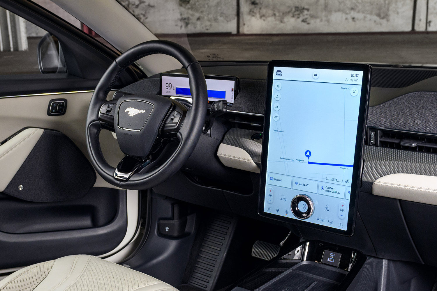
Although some drivers might miss the days of dashboards with more knobs, levers, and buttons than a commercial jet, simpler is now sold as better, according to user-experience research firm Nielsen Norman Group. By streamlining the control suite, carmakers can cut down on clutter and redundancy of functions and therefore have fewer costly wired connections to worry about.
In an effort to cut its button count, Kia has introduced new switchable haptic controls on its EV6 that alternate between controlling climate and managing audio and navigation functions. The dual-use controller does reduce the number of buttons, but it requires an extra bit of forethought by the user.
When simple functions — such as climate or audio controls — require not just a tap of a button but a search through multiple infotainment or navigation menus, the safety and convenience of a button-free environment come into question. A 2017 study by AAA Foundation for Traffic Safety reports that using a screen interface distracts drivers and can be dangerous.
 Hyundai
Brands Backtrack on Buttons and Knobs
Some automakers are now rethinking the wholesale move to virtual controls and are bringing at least some buttons back.
Honda has had mixed results with its attempts to do away with hard controls, particularly on its audio systems. The previous-generation Civic saw the old-fashioned volume knob disappear, replaced by a hard-to-operate haptic slider control. The move was unpopular. As a result, Honda started reintroducing volume knobs to infotainment units beginning in 2019, which delighted auto reviewers.
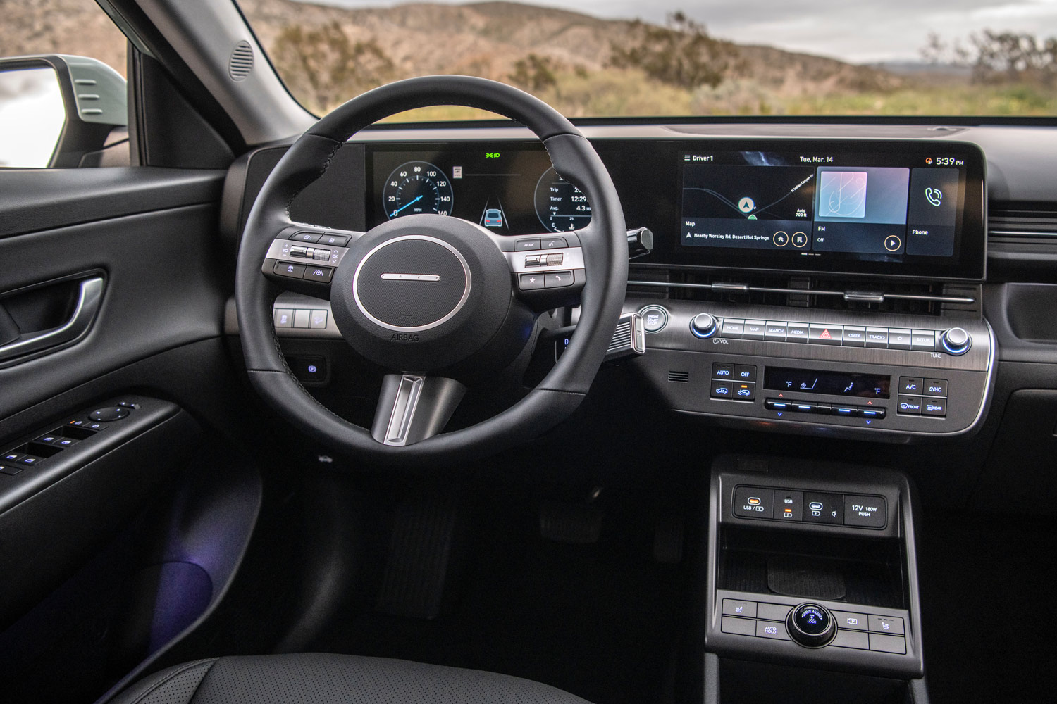
Hyundai promises to buck the trend. Design chief San Yup Lee recently told news outlets that it will buck the all-touch trend by continuing to mix hard controls with its touchscreens in the interest of keeping safety-related controls as easy to operate as possible.
Written by humans.
Edited by humans.
 Andy Stonehouse
Andy Stonehouse literally fell into the world of auto writing while working as a ski-town journalist, and has not looked back since. A childhood spent dealing with the eccentricities of a 1976 MG Midget has made any subsequent auto experience a more safe and reliable drive. He has been blessed with nearby mountain trails and snowy roads in Colorado to do TV-adventure-styled test drives on a weekly basis.
Related articles
View more related articles